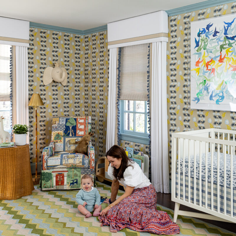
As a mother of four, there is no greater joy than having the opportunity to design a child’s bedroom. When invited to participate in the Living by Design Showhouse, a virtual space with no budget, I knew exactly where my maximalist design aesthetic would bring the greatest impact. While travel remains a primary inspiration for my design work, I imagined my youngest daughter, Lula, inhabiting this space. Vouloir, c’est pouvoir – where there’s a will, there’s a way – is the perfect French saying that embraces Lula’s resolute and unshakable personality. For a little girl’s bedroom, this mindset became the driving force behind a design meant to inspire and empower femininity.
When designing a bedroom for children, I believe firmly that it should grow with her and this design was no exception. Featuring odes to French design, this space will reflect history and serve to complement the interiors of the past while inspiring transformation throughout her own life. The feminine aesthetic will flow through soft hues, sophisticated patterns and rich woods bridging the whimsy of childhood to the elegance of a young woman.
Bedroom Design
Conceptualizing a space not bound geographically but intended to reach an audience around the world, our space transports you to 18th Century Europe. The bedroom is anchored by a custom lit à la polonaise. The grandeur of this bed, designed to impress visitors and draw focus to the owner of this suite, is covered in Pierre Frey’s Ahmedabad fabric and passementerie by Samuel & Sons as well as Houlès. We allowed the fabric’s pattern to influence the scalloped hem on the bedskirt. Feeling inspired by past visits to the Château de Malmaison and La Mirande, I pushed the limits of the design by maximizing layers in the space, incorporating quintessential French style Le Manach and Braquenié fabrics to add a depth of color and texture to the room. This lavish design is complemented and even enhanced by the walls enveloped in Jardin de Siam found in Zuber’s Scenic collection, a classic chinoiserie wallpaper.
The sunburst flush mount from Lamps Plus, along with the color block original art from Minted bring modern flair to balance the space. Custom designed parquet floors utilizing the Robbins Flooring Hickory Solid Hardwood make for a perfect timeless foundation throughout the bedroom and closet. I chose antique style stained doors to reinforce the warmth of the French inspired design.


Closet Design
We take seriously the task of designing a closet – especially for a little girl. In this instance, we created an extension to the bedroom offering not just well organized storage & beautifully displayed clothing, but more play space too.
Well planned cabinetry is key in closet design. Adding details to casework give a more furniture-like appearance and make the room feel special. California Closets offers a great line called the Everyday System, which offers an array of modular pieces all with different storage capabilities. It has a freestanding look about it with the contrasting gold metal supports and floating white shelving. By boxing out the left corner of the room to match the depth of the Everyday System, I was able to create two equal wall runs for the modular components. A simple framing change was all we needed to make this closet system look 100% custom. Working alongside California Closets was an exceptional experience with nearly unlimited options to bring out vision to life.


Bathroom Design
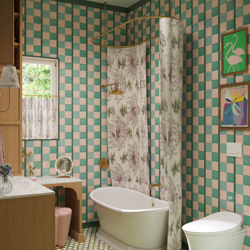
I wanted to design a space that carried the playful yet sophisticated aspects of the bedroom and closet over to the bathroom. I designed the floorpan to maximize space, opting for a tub/shower combo allowing room for an L-shaped vanity and makeup counter – essentials for a girl. The touch latch stained oak cabinets provide ample storage while adding a layer of warmth to the space.
We took Ann Sacks’ Elements Field Tile in a few different hues and created an unexpected & modern pattern that runs from floor to ceiling. The room is trimmed out in Ann Sacks’ Contemporary crown, base, and peaked liner, adding to the level of detailed craftsmanship put into the space. We carried the same Dunn Edwards DURA paint color from the bedroom ceiling into the bathroom and designed a custom scalloped flush mount, painted in DURA’s Forest Path and Soft Lilac, to add another touch of feminine flair.
As a mother of four, I’ve learned to lean in on the features offered by luxury plumbing brands like Kohler – especially in spaces designed for children. The gorgeous enameled cast iron slipper tub offers smooth edges and is equipped with a safeguard slip resistant surface so you can really feel safe with your littlest ones. Adding the diverter and rain head allow this tub to function as a bath for now and a shower when the time comes.
With its serpentine shape and stained exterior, I designed the sink vanity to look like a furniture piece adding another nod to 18th Century France. The statuary marble backsplash carries that curved shape up the wall, mimicking the outline of the custom bonnet top mirror. We chose a wall mounted faucet which makes cleaning a breeze. Selecting Kohler’s Vibrant Brushed Moderne Brass finish for all the plumbing fixtures used in the space, achieved my desired classic aged brass look without the maintenance and constant fingerprint wiping.


These spaces are made possible by official Living by Design Virtual Showhouse sponsors including Lamps Plus, Robbins Flooring, Dunn-Edwards DURA, Minted, Ann Sacks, Kohler and California Closets who allowed us to place their beautiful products in this children’s bedroom, bathroom and closet. In addition to our primary partners on this project, you can find Summer Classics products in the exterior spaces of the home. Our designs were brought to “life” by the talented creators at YouSee Studio. Many thanks to the Embello team for selecting me to participate. What fun!


